Ludus product and art direction
Selected direction (October 7, 2026): Quiet Studio with the Ludus Block identity. The approved logo is a mint, extruded capital L on a rounded charcoal tile. Its clear silhouette, solid construction and restrained depth set the visual direction for the editor, default project icon, documentation and eventual website. It does not prescribe the art style of games made with Ludus.
The artwork is wired into the editor's Qt resources, Welcome and recent-project views, macOS app bundle, wiki branding and browser editor package. The production theme now applies the light/dark roles below to the Qt workspace and project creation dialog. The multiplatform GUI systems and interaction design continue to own the compact contextual row, useful central documents and optional secondary panels. Native OS decoration/menu conventions stay native; the browser gets no simulated OS title bar. A shared semantic component/token layer must style Qt controls coherently; surrounding HTML cannot theme a Qt canvas. See the October 6 review for the actually read Excise, Progressive Disclosure and Evaluation excerpts.
Product promise
Make creative work predictable. Ludus owns routine setup, shows what is happening, and protects the user's work. Complexity is available when it serves a task. People should understand a command's outcome before invoking it and recover from a failed operation without reconstructing their workspace.
This promise constrains implementation: one command and capability policy across menus/buttons/shortcuts, one shared project backend across editor/CLI, explicit save/discard/cancel, truthful progress, and verified publication. Automation must reduce decisions without hiding failures or silently changing engine identity.
Ludus Block identity
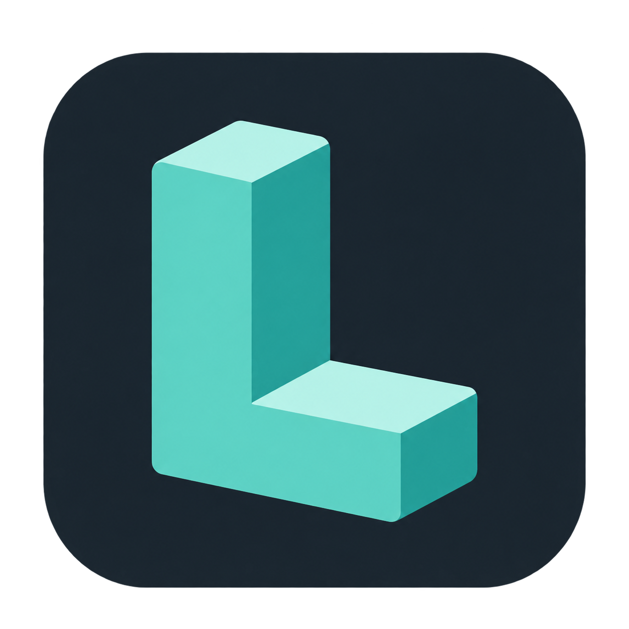
The standalone transparent mark and
rounded tile icon are the approved visual
references. Both are 1254 × 1254 PNGs with alpha, created with built-in image
generation and approved by the project owner on October 7, 2026.
These PNGs are the shared artwork source for Qt resources, wiki branding and
browser packaging. The macOS bundle uses a derived ICNS file containing 16,
32, 128, 256 and 512 logical pixel icons at 1× and 2×. Regenerate it with macOS
sips exports named icon_NxN.png / icon_NxN@2x.png in a .iconset directory,
then iconutil -c icns; preserve the approved source artwork. The 16, 24 and 32 pixel
icons are drawn rather than scaled: scripts/python/render_small_icons.py redraws the tile
and the L's five planes from the reference's construction with flat brand colours, corners
snapped to the pixel grid, into docs/wiki/assets/small (the Editor's window icon picks the
nearest of these) and the setup window's init_assets. The ICNS still derives from the
reference, and a production vector master remains future refinement.

The letter should read as a building block: substantial, approachable and precise. Preserve the upright stem, projecting foot, open inner corner and consistent isometric perspective. Pale mint top planes and deeper teal side planes explain the volume. The approved raster has gentle shading and rounded edges; retain that character in large brand artwork, while small exports may simplify shading to solid planes so the silhouette stays clear.
| Brand role | Target color | Use |
|---|---|---|
| Mint front face | #57d2c1 |
Dominant logo color; dark-theme primary actions and focus |
| Pale mint top plane | #b6f3e8 |
Logo highlights and restrained supporting brand artwork |
| Deep teal side plane | #229e95 |
Logo depth; supporting brand artwork |
| Charcoal tile | #18232c |
Application icon backdrop and dark workspace anchor |
These are reproducible design tokens, not exact samples of every shaded pixel in the generated reference. Brand plane colors are not automatically suitable for text or interaction states; use the semantic tokens below.
Mark and icon use
- Use the charcoal tile for the editor application icon and the default icon of a project without its own artwork. User-supplied project artwork takes precedence; the fallback must not imply that every game shares Ludus branding.
- Use the standalone mark for documentation headers and Welcome branding when the surrounding surface already supplies a clear backdrop. Keep branding small in an active workspace so scene content remains the visual focus.
- Preserve aspect ratio, orientation and palette. Keep clear space of at least one sixth of the mark's width around the standalone mark; do not crop the foot or fill its inner corner. The supplied tile already includes its own inset.
- Keep the mark free of text, status badges, selection tint and animation. Place project names and operation/status indicators beside the icon. Use ordinary semantic glyphs for commands, files and diagnostics.
- Validate dedicated 16, 24, 32, 48, 64 and 128 pixel exports on dark and light surfaces. At small sizes simplify shading and tune edges to the pixel grid; do not assume scaling the reference PNG alone yields a readable icon. Platform packaging must account for OS masks and avoid applying a second rounded tile.
Earlier direction studies
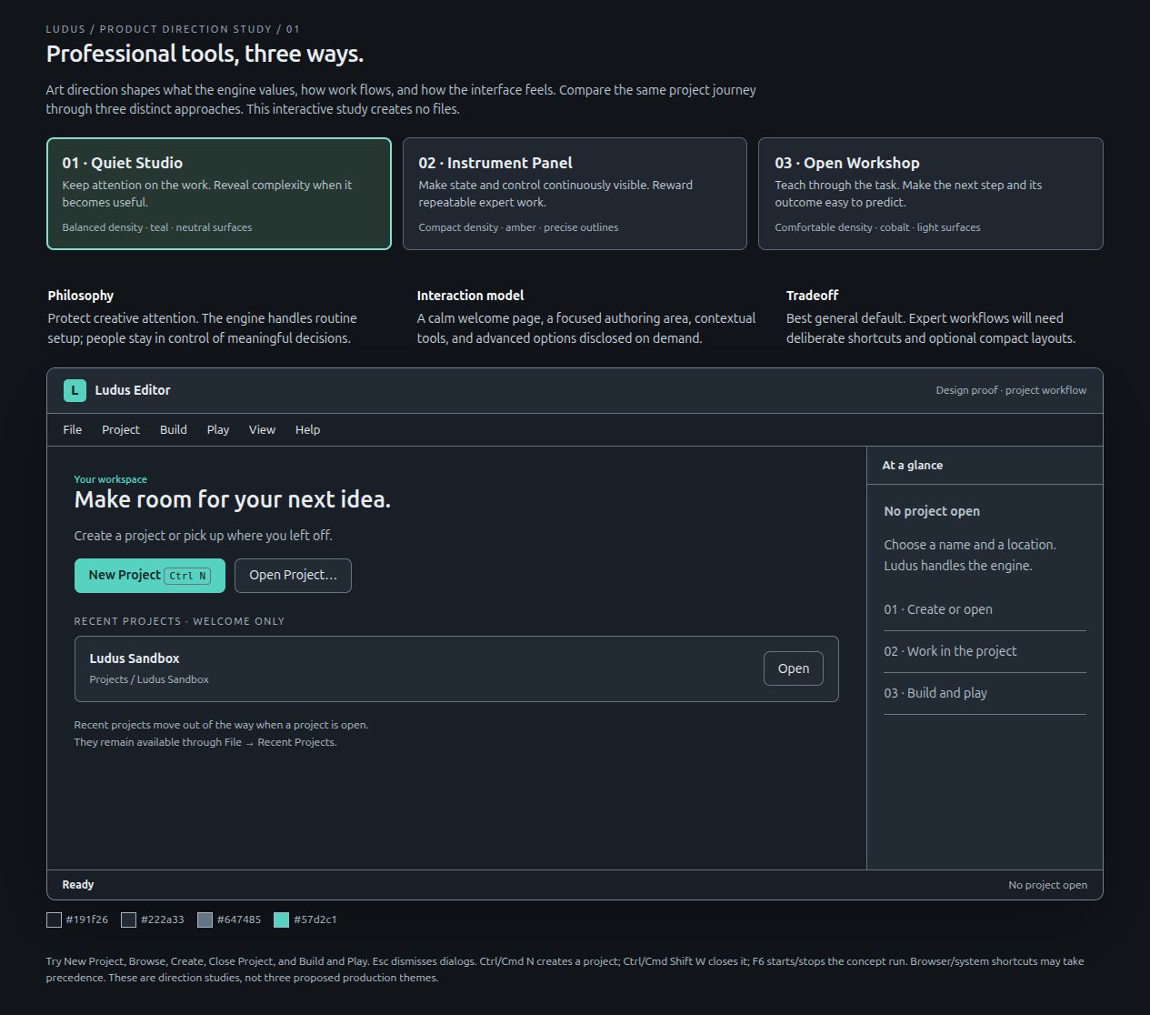
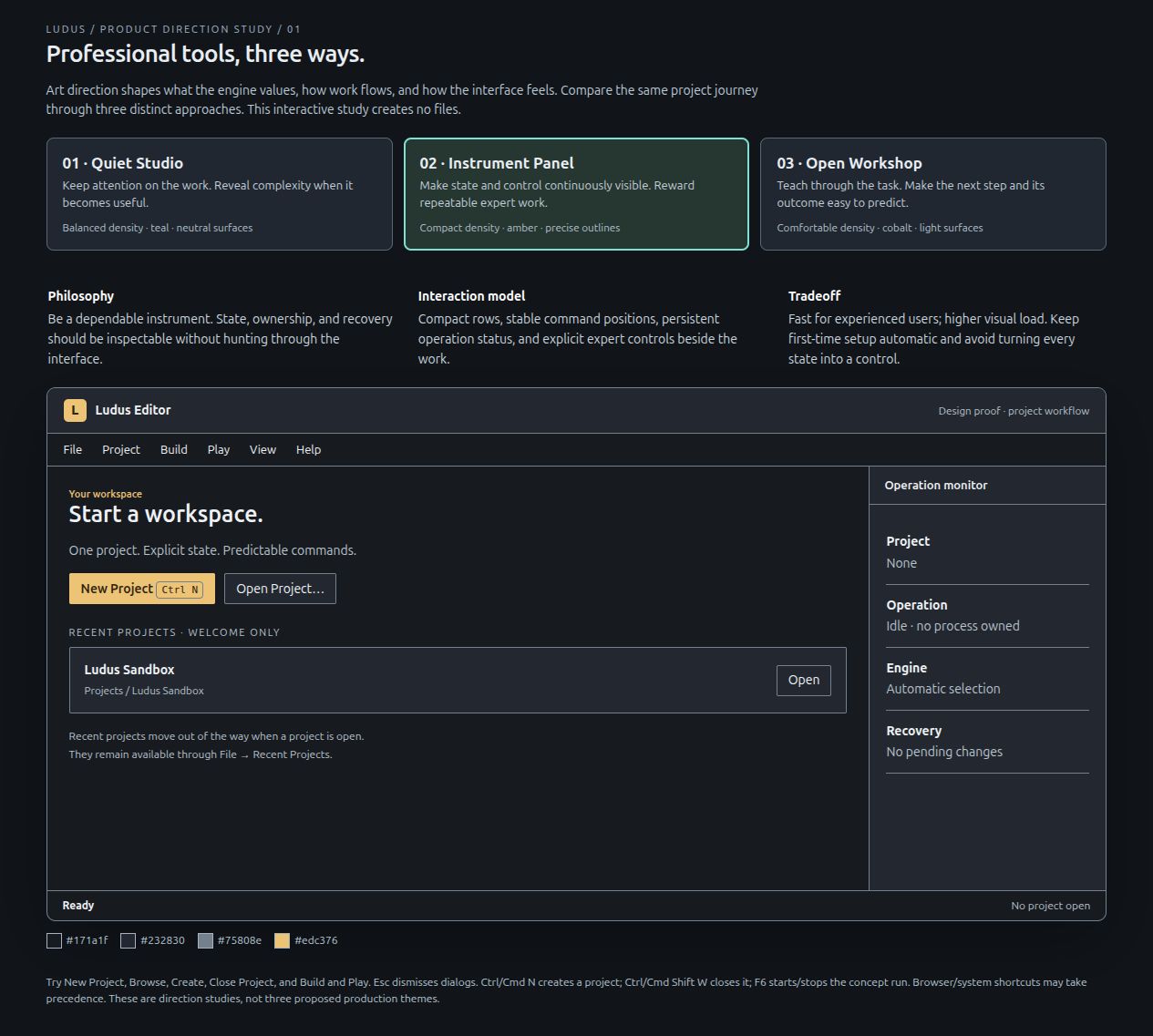
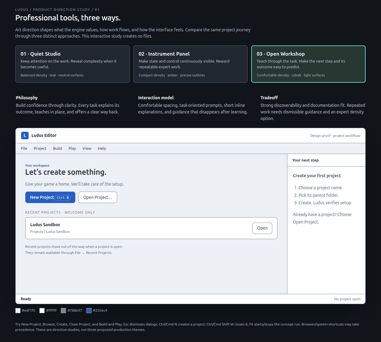
Open the interactive proof of concept locally in a browser. Switch the direction cards, then try New Project, Browse, Create, Close Project, and Build and Play. It simulates those interactions and creates no files. The desktop implementation uses a real folder picker and verified backend. This prototype and the captures below predate the selected Ludus Block identity. They remain interaction studies, not the current palette or a production theme.
| Direction | Philosophy | UI/UX emphasis | Visual language | Cost and tradeoff |
|---|---|---|---|---|
| Quiet Studio (selected interaction model) | Protect attention; reveal complexity when useful | Task-focused Welcome; contextual authoring tools; advanced choices on demand; discoverable shortcuts | Earlier graphite/teal study; now refined by the Ludus Block identity | Lowest default visual load; expert speed requires deliberate shortcuts and compact layouts |
| Instrument Panel | Be a dependable, inspectable instrument | Compact rows; fixed command positions; continuous operation/ownership/recovery status | Charcoal, amber accent, square edges, precise strong dividers | Expert efficiency; more visual load and a higher learning burden if status becomes controls |
| Open Workshop | Build confidence through the task | Comfortable spacing; short explanations of outcomes; guidance that can be dismissed as skill grows | Light surfaces, cobalt actions, generous spacing, clear section structure | Accessible onboarding and documentation fit; repeated work needs a compact option |
Selected combination: Quiet Studio's attention model, Instrument Panel's truthful status/recovery, and Open Workshop's plain language. Keep one coherent default; do not combine all three layouts or add permanent guidance/status columns. Dark/light appearance is an accessibility and environment preference. Both appearances use the same mint/teal identity; cobalt from the earlier studies is not an alternate brand palette to ship. Amber is a functional role (the selected object), like success and danger, not a second brand colour.
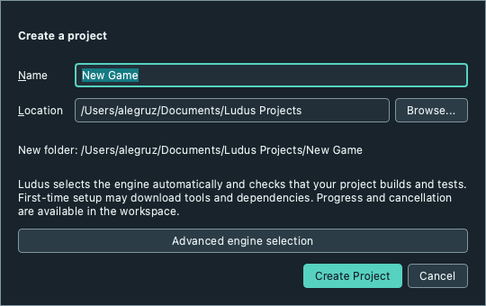
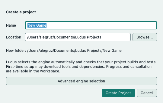
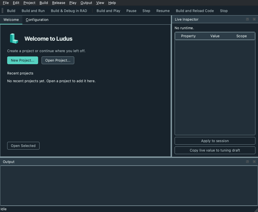
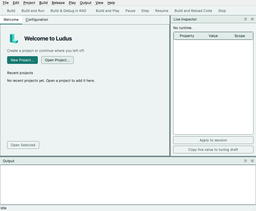
The captured concept views are Quiet Studio, Instrument Panel, and Open Workshop. Actual Qt creation captures: dark and light; these show the implemented Ludus Block theme. Workspace captures are available in dark and light appearance.
Common interaction rules
- Creation: Name → Location with Browse → Create Project. Show the resulting new folder. Engine discovery and preparation happen behind this explicit action; specialist override lives in Advanced. Explain first-time downloads before Create.
- Workspace: Welcome carries recents while no project is open. Loaded projects receive the authoring area; File → Recent Projects remains available. Tool windows can be hidden through the Window menu; Window → Reset Window Layout always restores access.
- Ownership: a dialog has an unmistakable outer edge, title, primary action, and Cancel. Panels have visible title and splitter boundaries. Keyboard focus is visible, and disabled actions use the same capability rules everywhere.
- Closing: preserve settings/audio drafts with Save/Discard/Cancel. Failed Save and Cancel retain the project. Stop active work before Close Project; Close Project returns to Welcome without quitting the editor.
- Language: use verbs and outcomes. “Create Project” beats “OK”. Label Save Project Settings accurately until S2 adds focused document save routing.
- Feedback: identify operation and result; diagnostics remain selectable. Never claim readiness until configure/build/tests have completed. Do not steal selection or reset focused fields on runtime heartbeats (S2 acceptance).
Visual system target
The HTML study has isolated surface/text/border/accent/radius tokens. The Qt component layer now applies these roles to panel surfaces, tabs, fields, buttons, lists, table headers and focus borders. Welcome groups its primary creation/open actions above the recent-project list. Application palette changes refresh the light/dark appearance; platform fonts, menus and window decoration remain native. It uses logical pixels and layout managers, with no custom title-bar hit testing.
Use cool charcoal surfaces, mint actions, readable neutral text and modest rounding. Translate the logo's construction into clear panel grouping and strong silhouettes. Controls remain flat and easy to scan; isometric faces, bevels and shaded blocks belong to brand artwork, not every button or panel.
The Qt layer has no stylesheet. ApplyWorkspaceStyle completes a palette from the
tokens (MakeEditorPalette: surfaces, text, mid and light roles, selection,
placeholder as secondary text, disabled text) and installs one EditorStyle, a
QProxyStyle over the platform style, that draws the pieces the palette cannot:
button and field edges and focus rings, tab underlines, dock titles, toolbar and
status bar rules, header sections and the dock separator. Controls therefore
inherit palette changes normally, keep platform metrics where they are not
overridden, and show the focus ring in the same widths (2 px, 3 px in high
contrast) in both appearances. visualRole (primary, secondary) and
density=compact properties are read by the style, and itemPadding pads a list's
rows. The few per-widget setStyleSheet calls that remain (graph node details,
quick add, the world graph view and the state view) are local and are the
candidates for the next pass. The [style][.gallery] test writes a gallery of the
controls in dark, light and high contrast to LUDUS_STYLE_GALLERY_DIR for visual
comparison.
The tokens live in one file, config/design-tokens.json.
The Editor reads a header generated from it at configure time
(apps/editor/DesignTokens.cmake), the setup window reads it through
scripts/python/design_tokens.py, and the browser editor's editor.css carries a
generated block of --ludus-* custom properties (python3
scripts/python/design_tokens.py --write refreshes it). The file also lists the
contrast pairs that must hold in both appearances; the Editor tests
([design-tokens]) and scripts/python/test_design_tokens.py fail when a value
breaks one. The table shows the core roles; the file is authoritative.
| Semantic token | Dark appearance | Light appearance |
|---|---|---|
| Workspace / panel | #18232c / #222f39 |
#f1efea / #ffffff |
| Raised surface | #2c3c47 |
#e6e3dc |
| Text / secondary text / hints | #e9f2f1 / #b5c5c9 / #9bafb4 |
#18232c / #4c6267 / #4f6468 |
| Border (controls) / divider | #80969e / #3a4d59 |
#71878b / #d3d0c8 |
| Primary fill / text on fill | #57d2c1 / #18232c |
#14786f / #ffffff |
| Focus ring / interactive text | #57d2c1 |
#14786f |
| Selected surface / text | #294b4b / #e9f2f1 |
#d5eee8 / #18232c |
| Viewport (both appearances) | #090c0f |
#090c0f |
| Selection amber (viewport and graph canvas) | #ffd25a |
#ffd25a |
The light appearance uses warm paper neutrals rather than mint-grey, while the mint/teal brand colours are unchanged. The viewport stays dark in both appearances so lighting judgements do not change with the interface theme.
Mint is the recognizable brand color in both appearances. On a light surface, use the darker semantic teal for interactive text, focus rings and primary button fills; reserve bright mint for artwork or fills with charcoal text. Keep text and focus legible against every hover, pressed, selected and disabled surface. Before shipping, verify at least 4.5:1 for normal text and 3:1 for large text and essential control/focus boundaries in the actual rendered components. Selection and keyboard focus need distinct treatments, such as a tinted selection surface and an explicit focus outline, even when combined.
Use 4 logical px corner radii for compact controls, 6 for grouped surfaces and 8 for Welcome/project cards. The icon tile's broad rounding is a branding proportion, not a radius to apply to dense editor controls. Distinguish workspace, panels and raised dialogs through surface values, restrained borders and explicit splitter boundaries. Avoid floating card decoration around every inspector field; long property lists need consistent alignment and compact rows.
Use a system sans-serif font; monospace only for paths, code and numeric debug
values. Use a small spacing scale (4/8/12/16/24/32 logical px, the design::SPACING_*
tokens; layout code never types a pixel value, and the [style][spacing] test enforces
it), clear section titles in the Title type role, and text with icons for primary
actions. Peers in a run of symmetric commands (Undo/Redo, Pause/Step/Resume) are
icon-only with a tooltip. Match command glyphs by optical size,
stroke weight and modest rounding; reserve the dimensional L for branding.
Combo boxes reserve the full text advance, including letter spacing and glyph
bearings, alongside their arrow column. Qt's ink bounds can be narrower than
that advance; the shared style accounts for the difference while preserving
icon space and the control's size-adjustment policy. When sizing to contents,
check every offered item, including an item wider than the current selection,
with ordinary and spaced fonts.
Accent identifies selection/focus and primary actions; warning/error/success
also need words or symbols and separate semantic treatments. In particular,
mint action styling alone must not imply successful completion.
Use balanced density by default and a compact option for repeated expert work. Welcome and project creation can have more breathing room and a visible mark; the authoring workspace keeps chrome quiet around the central document. No decorative animation during editing, rotating logo, glossy control gradients, glow, glass blur or external font downloads. Respect reduced-motion preferences for any functional transition introduced later.
The shared component layer must apply these roles to native and browser presentations while preserving each platform's navigation and decoration conventions. High-contrast/system accessibility appearances may override colors or effects to preserve readability and state visibility.
Validation before implementation acceptance
The logo selection fixes the identity; usability and component validation still determine how the editor applies it. Run the same tasks against the updated Quiet Studio design, then the native editor: create a project without knowing SDK locations, choose its parent folder, cancel creation, reopen a recent project, find a shortcut, attempt close with unsaved changes, cancel, save and close, and recover a hidden panel. Observe novice and experienced contributors; record completion, wrong turns, help requests, expected outcome, and preference with a reason. Do not treat preference or screenshots alone as proof of usability. Check dark/light, keyboard-only navigation, 900×740 and high-DPI layouts, long paths, and the actual desktop folder picker. Check logo exports at actual size, projects with custom artwork, focus combined with selection, and readable diagnostics independent of brand color. Record whether captures show the historical prototype, a themed component study or the shipped editor; approval of the logo is not evidence of completed theme integration.
Consulted design references
The TOC reading guide remains the catalogue; selected chapters were read, rather than treating a chapter title as evidence. Thanks to David Lightbown, Designing the User Experience of Game Development Tools (CRC Press, 2015), ch. 4 pp. 53–62 (mental models/task flows), ch. 5 pp. 80–86 (hierarchy/constraints/mapping), pp. 112–115 (progressive disclosure), and ch. 6 pp. 117–129 (evaluation). Author's companion site. Adaptation: compare task-based concepts and disclose engine selection; retain native controls rather than reproducing the book's illustrative interfaces.
Thanks to Graham Wihlidal, Game Engine Toolset Development (Thomson Course Technology, 2006), ch. 37 pp. 423–430, “Responsive UI During Intensive Processing.” Author's book. Adopt responsive, cancellable operations; preserve Ludus's existing supervised adapters and exception-free C++ instead of the historical .NET examples. See the design review for implementation decisions and evidence.